.png)

Mumbai
Meri Jaan
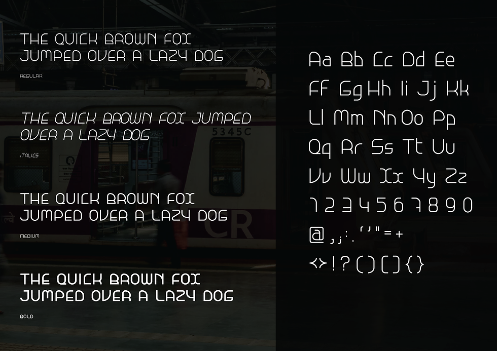
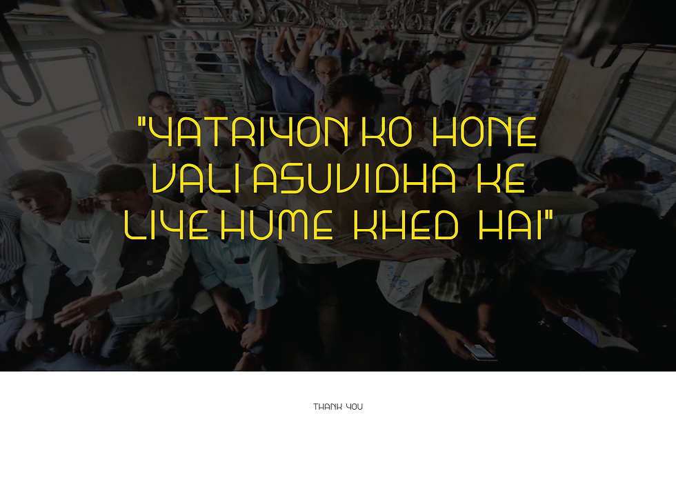
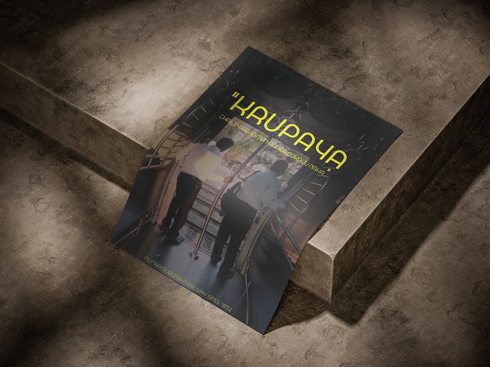
MUMBAI LOCAL IS A LATIN SCRIPT DISPLAY TYPEFACE INSPIRED BY MUMBAI SUBURBAN RAILWAYS.THIS PROJECT STRIVES TO CONSERVE THE CULTURAL VALUES OF MUMBAI LOCAL TRAINS. IT TAKES INSPIRATION FROM THE STRUCTURE, CHARACTER AND PEOPLE.
-09.png)


Inspiration
Every shape and form in the train’s interior and structure has curved and rounded edges keeping in mind the safety of the passengers. Taking inspiration from the curves and corners I tried designing the letterforms.

Eventhough this typeface is inspired by Mumbai local trains, it is not meant to be used on signages and general information designs. Since its a display typeface it is more expressive and is intended to make a strong visual impact. More of an experimental approach than problem solving.

The inspiration for the second version of the typeface comes from the concept of junctions and stations. (Two or more lines intersection will be a junction and corners will be stops.)


-08.png)

Studying letterforms and type anatomy

After tracing out forms and shapes from the structure as well as the interior, I started building shape language to maintain throughout the type

For the construction, the curves are kept constant in most of the letters and reflected to maintain it on the right side accoring to the need.
.png)